Quick Guide to the Figures:
All figures are interactive.
- Click and drag to zoom to that area
- Double-click to reset the view
- A single click on the legend label toggles visibility, double-click isolates that trace
- Mouse-over a datapoint shows its values
- Mouse-over the top right to see the full toolbar
The line plot shows, day by day, the growing total of membership fees pledged by existing members for the next twelve months. For many NGOs, this is the key indicator of their income situation. It reacts much faster than the actual contributions received – a decisive advantage for financial planning. The bar chart below shows monthly inflows and departures, as well as contribution changes. (Not currently simulated here.)
Below that, the number of members over time is presented in a similar figure.
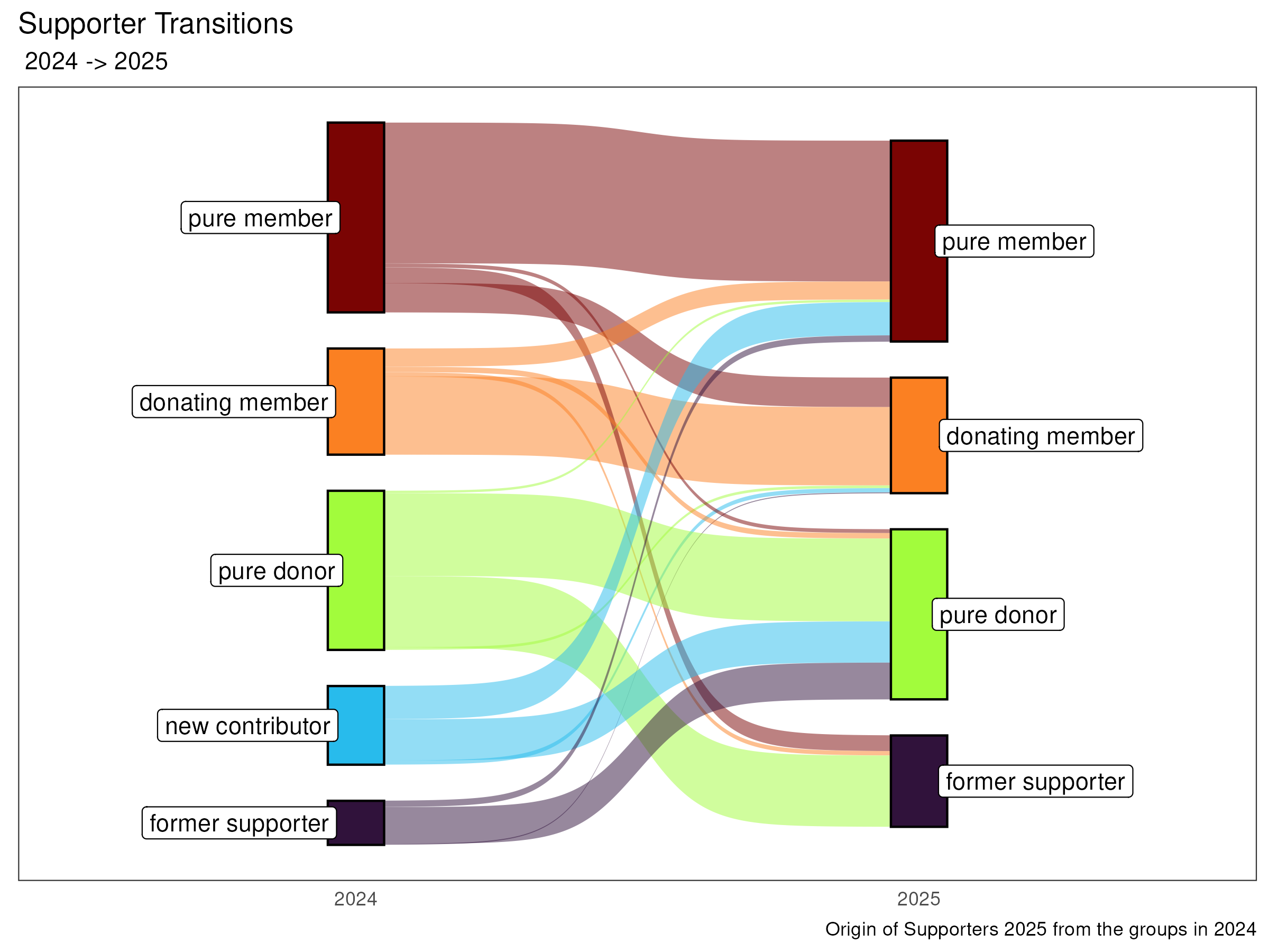
The graph shows the flow of individual supporters from one group in 2023 to the next in 2024.It is part of the automatically generated annual report and is created directly from the fundraising database. (In this case, fictitious data for Trees4Teuto, but this has already been implemented for other databases.)